


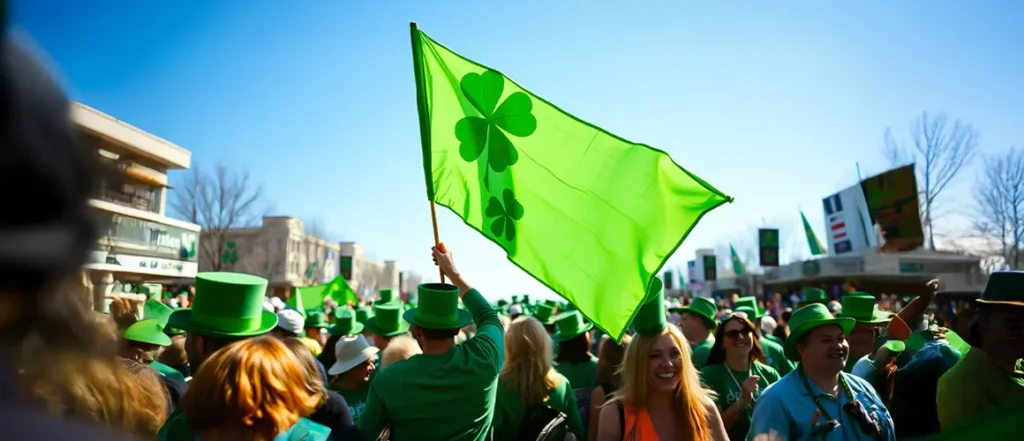
From parades to product packaging, St. Patrick’s Day colours dominate the marketing scene every March. But have you ever wondered why green is the defining shade of this Irish holiday? More importantly, how do businesses strategically use these colours in advertising and branding to attract customers and boost seasonal sales? This guide dives into the history of St. Patrick’s Day colours, their deeper meanings, and how brands leverage them to create impactful Irish-themed marketing campaigns.
The History of St. Patrick’s Day Colours
Surprisingly, green wasn’t always the signature colour of St. Patrick’s Day. Historically, blue was associated with St. Patrick, as seen in ancient Irish symbols and royal attire.
How Green Became the Official Colour
- The Irish Rebellion (1798): During the fight for independence, Irish soldiers wore green uniforms, making it a symbol of national pride.
- The Shamrock Connection: St. Patrick was said to have used the three-leaf clover (shamrock) to explain the Holy Trinity, linking green to Irish heritage and Christianity.
- The “Wearing of the Green”: A phrase originating from Irish folk songs, emphasizing the cultural and political significance of green attire and accessories.
Today, St. Patrick’s Day colours represent more than just a holiday—they symbolize heritage, luck, and celebration, making them a marketing goldmine.
Green Colour Symbolism in Advertising
Brands use colour psychology to shape how people perceive their products, and green is one of the most versatile colours in marketing.
Why Green Works for St. Patrick’s Day Marketing:
✅ Symbolizes luck & prosperity – Perfect for sales and promotions.
✅ Evokes nature & freshness – Used by eco-friendly brands.
✅ Creates emotional balance – A calming, trust-building colour.
🔹 Example: Starbucks embraces green branding all year, but during St. Patrick’s Day, it enhances Irish-themed promotions with limited-edition green cups and shamrock-inspired designs.
St. Patrick’s Day Colours Meaning: Beyond Just Green
Although green dominates St. Patrick’s Day advertising, other colours also play a role in Irish-themed branding.
| Colour | Symbolism | Marketing Use |
| Green | Luck, prosperity, nature | Used in logos, packaging, and festive promotions |
| Gold | Wealth, success, prestige | Highlights luxury, used for limited-time offers |
| White | Purity, peace, unity | Complements green for a clean, balanced design |
| Orange | Energy, warmth, excitement | Adds contrast to create eye-catching ads |

🔹 Example: Many brands use green and gold together in advertising to emphasize luck and luxury, especially in St. Patrick’s Day promotions for contests, giveaways, and seasonal product launches.
How Brands Use St. Patrick’s Day Colours in Ads
Successful St. Patrick’s Day marketing campaigns don’t just throw green into a design—they use it strategically.
1. Limited-Edition Product Packaging
- McDonald’s Shamrock Shake – A perfect example of seasonal branding, using green packaging and promotions to drive excitement.
- Guinness Beer – A staple in Irish-themed celebrations, leveraging green and gold visuals to reinforce its Irish heritage.
2. Themed Social Media Campaigns
- Brands add shamrock icons, green filters, and Irish fonts to their social media graphics.
- Limited-time “Go Green” deals on products encourage urgency.
3. St. Patrick’s Day Email Marketing & Banners
- Email subject lines use green emojis (🍀) and phrases like “Lucky Deals Await!”
- Banners incorporate white backgrounds with bold green headlines, ensuring readability while staying festive.
🔹 Example: A fashion brand promoting a “Wear Green & Save 20%” campaign effectively aligns colour symbolism with an engaging call-to-action.
Best Colour Combinations for St. Patrick’s Day Marketing
Pairing green with complementary shades can enhance branding without making it overwhelming.
| Colour Combination | Effect | Best For |
| Green & Gold | Luxury & fortune | High-end promotions, limited editions |
| Green & White | Clean & professional | Corporate branding, event signage |
| Green & Black | Bold & dramatic | Beverage & nightlife marketing |
| Green & Orange | Energetic & eye-catching | Retail, sales promotions |
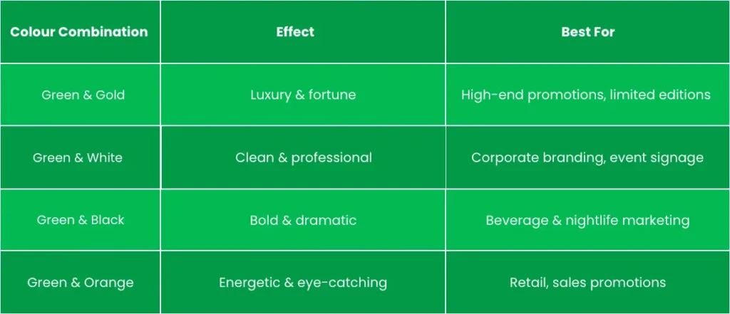
🔹 Example: A tech brand launching a St. Patrick’s Day sale can use green, white, and gold to maintain a premium, modern look.
Irish-Themed Branding: Do’s and Don’ts
Before you flood your marketing materials with green, keep these design tips in mind:
✅ DO:
✔ Use subtle shamrocks or Celtic designs for authenticity.
✔ Stick to minimalist layouts for a modern, clean aesthetic.
✔ Test green contrasts to ensure readability in digital ads.
❌ DON’T:
✖ Overload designs with too many St. Patrick’s Day symbols (clovers, pots of gold, leprechauns—pick one).
✖ Use low-quality green overlays that look generic.
✖ Forget to align messaging with your brand identity.
🔹 Example: A premium skincare brand should focus on elegant gold accents and refined green typography, rather than cartoonish leprechauns.
Writer’s Notes on Leveraging St. Patrick’s Day Colours for Impactful Advertising
The history of St. Patrick’s Day colours offers more than just a festive theme—it provides an opportunity for businesses to engage with customers through smart colour choices and symbolic marketing.
By incorporating green, gold, white, and orange strategically, brands can create visually compelling campaigns that feel both seasonal and professional. Whether through limited-edition packaging, social media promotions, or themed in-store displays, using these colours effectively ensures your St. Patrick’s Day marketing stands out in a crowded space.
Want to make your next campaign a success? Choose your colours wisely—because in marketing, every shade tells a story.
Written by BannerBuzz Editorial Team.

 Posted in