


Minimalist design has reshaped modern advertising, proving that simplicity can be just as powerful – if not more effective – than complexity. In a world filled with visual noise, well-crafted minimalist signage design ensures your message is clear, impactful, and memorable.
From retail storefronts to trade shows, minimalist signage isn’t just about aesthetics – it’s about enhancing visibility, improving readability, and strengthening brand identity. When executed correctly, it draws attention while maintaining a professional and sophisticated look.
Why Minimalist Signage Works for Modern Businesses
Businesses today compete for customer attention in crowded high streets, shopping centres, and digital spaces. Cluttered signage with excessive text or unnecessary graphics often fails to make an impression. Minimalist advertising, on the other hand, relies on clean lines, simple typography, and strategic use of space to communicate a message effectively.
The core benefits of minimalist signage include:
- Instant Recognition – Simple and effective business signage ensures key messages are absorbed quickly.
- Professional Appeal – A clean design conveys credibility and confidence.
- Versatility – Works across different materials, from window decals to pavement signs.
- Better Readability – High contrast and concise messaging improve visibility, even from a distance.
For businesses aiming to modernise their branding, minimalist signage is an essential tool that aligns with today’s sleek, contemporary aesthetic.
How to Design Minimalist Signage That Stands Out
1. Focus on One Clear Message
The essence of minimalist design is clarity. Whether designing window signs for retail or banner stands for trade shows, limit your message to a single, impactful statement.
- Keep text short and direct. Instead of “Welcome to Our Store, We Have the Best Offers on Electronics,” use “Exclusive Tech Deals Inside.”
- Choose one focal point – this could be your logo, slogan, or a key offer.
- Avoid unnecessary decorative elements that don’t enhance the message.
Also Read: Signage Trends 2025: The Role of Personalised Signs in Travel and MICE
2. Use Simple, High-Contrast Colours

Minimalist design principles in advertising often rely on monochrome palettes or two-tone contrasts for maximum impact.
- White backgrounds with bold black or deep navy text work well for modern businesses.
- High-contrast combinations like black and gold or white and red ensure better readability, even from a distance.
- Avoid gradients or overly complex textures that distract from the message.
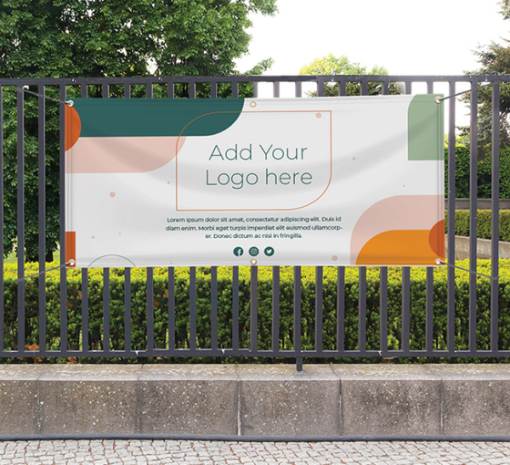
Many custom banners and trade show displays use a neutral background with a pop of colour in the logo or tagline, helping the brand remain both modern and eye-catching.
3. Choose the Right Typeface
Typography plays a major role in minimalist signage design. The right typeface can enhance readability and communicate brand personality without extra graphics.
- Sans-serif fonts such as Helvetica, Futura, or Avenir give a clean, modern feel.
- Stick to one or two font styles—mixing too many can create unnecessary clutter.
- Ensure letter spacing (kerning) is balanced for better legibility.
A well-designed pavement sign or custom flag with the right typography can effectively guide customers into your business without overwhelming them with too much detail.
4. Leave Plenty of White Space
White space (or negative space) is one of the most powerful tools in minimalist advertising. It draws attention to the key elements and creates a sense of balance.
- Give text and logos room to breathe – don’t overcrowd the design.
- Use alignment strategically; centred text often works well for minimalist signage.
- Don’t feel the need to fill every inch of your banner or display with content.
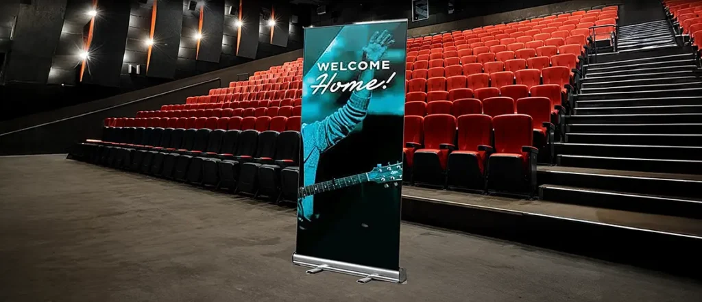
Well-spaced window stickers or roller banners create a luxurious and refined look while still being functional.
5. Invest in High-Quality Materials
Minimalist signage depends on sharp printing and premium materials to make an impact. Since the design itself is understated, the quality of the print, finish, and structure becomes even more noticeable.
- Matte finishes often work better than glossy ones for a subtle, high-end look.
- Aluminium or acrylic signage with simple, engraved text creates a sleek effect.
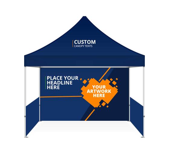
- Fabric banners and tension displays provide a smooth, seamless finish for trade show setups.
For example, an elegant pull-up banner at an event featuring only a logo, tagline, and single line of text can be more effective than a cluttered poster with excessive information.
6. Adapt Minimalist Signage to Different Formats
Minimalism is not one-size-fits-all. Whether using signage indoors, outdoors, or at events, the design approach should be adjusted accordingly.
- For storefronts and retail spaces: Window decals and hanging signs with minimal wording and bold fonts work best.
- For outdoor advertising: Pavement signs and A-frames with high-contrast messaging ensure passersby can read your message quickly.
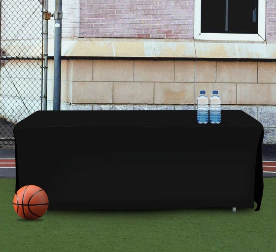
- For trade shows and exhibitions: Custom table covers with a simple logo and step-and-repeat backdrops with a neutral base create a professional, clutter-free environment.
Common Mistakes to Avoid in Minimalist Signage Design

Even with the best intentions, minimalist signage can lose impact if certain mistakes are made. Avoid:
- Using fonts that are too thin or light, which become hard to read from a distance.
- Leaving out key information – while minimalism means cutting excess, essential details like contact info or a call-to-action should still be present.
- Choosing colours that are too similar, making the text blend into the background.
A well-executed simple and effective business signage strategy ensures the right balance between aesthetic appeal and practical communication.
Expert Advice:
As businesses continue shifting toward clean, modern branding, minimalist signage will remain a leading trend in visual communication. Whether you’re revamping your retail display, updating event signage, or improving brand consistency, keeping designs simple yet impactful will ensure lasting impressions.
For businesses looking to create high-quality, professional signage, investing in minimalist design isn’t just a style choice – it’s a strategic decision that enhances brand perception, customer engagement, and advertising effectiveness.
Written by BannerBuzz Editorial Team.

 Posted in