Brochures remain one of the most versatile and impactful marketing tools. Whether you’re promoting a product, service, or event, a well-designed brochure captures attention and communicates your message effectively. Its tangible nature allows businesses to create a personal connection with their audience, making brochures a powerful tool in any marketing campaign.
In today’s competitive market, creating a brochure that stands out requires more than just good design; it involves strategic planning, engaging visuals, and clear communication. Businesses are increasingly opting for custom brochures, custom booklets, and custom catalogs to ensure their materials reflect their brand and purpose perfectly.
This guide will walk you through the steps to design a professional brochure, offering practical tips and creative brochure design ideas. Whether it’s for a promotional event, an informational booklet, or even appointment cards, you’ll learn how to create a brochure that truly makes an impact.
Understand Your Audience and Purpose
Before starting the design process, define the purpose of your brochure and understand your target audience. Are you creating a brochure for a business, a promotional event, or an informational booklet? Clarify the objectives and key messages you want to communicate.
- Audience Insight: Tailor your content and design to appeal to the specific needs and preferences of your audience. Consider their interests, challenges, and how your brochure can address them effectively.
- Brochure Objectives: Determine whether your brochure aims to inform, persuade, or provide specific instructions. This clarity will guide the design and content decisions throughout the process.
Step 1: Define the Structure
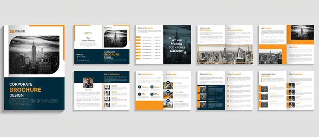
A well-structured brochure is essential for effective communication. Here’s how to organise your brochure for maximum impact:
- Front Cover: This is the first impression your brochure makes. Ensure it includes an eye-catching design and a compelling headline. Use high-quality images and clear branding to grab attention.
- Inside Pages: Divide the content into logical sections, such as introduction, main features, benefits, and a call-to-action. Use headings, subheadings, and bullet points to make the information easy to scan.
- Back Cover: This section often includes contact information, additional branding, or a final call-to-action. Make sure it aligns with the brochure’s overall theme and provides clear next steps for the reader.
Step 2: Design Engaging Visuals
Visuals play a critical role in making your brochure appealing and engaging. Here are some tips for incorporating effective visuals:
- High-Quality Images: Use high-resolution images that relate to the brochure’s content. Avoid generic stock photos; instead, opt for images that reflect your brand and message.
- Consistent Branding: Ensure that your visuals align with your brand’s colours, fonts, and overall style. This consistency reinforces brand identity and makes your brochure more memorable.
- Visual Hierarchy: Create a visual hierarchy by varying font sizes, colours, and image placements. This helps guide the reader’s eye to the most important information first.
Step 3: Craft Clear and Compelling Content
The text in your brochure should be concise, clear, and compelling. Here are some tips for effective content writing:
- Clear Messaging: Use straightforward language to convey your message. Avoid jargon and complex sentences that might confuse the reader.
- Engaging Headlines: Craft attention-grabbing headlines for each section. They should clearly indicate the content that follows and entice the reader to continue.
- Benefits Over Features: Focus on the benefits of your product or service rather than just listing features. Explain how your offering solves a problem or meets a need.
- Call-to-Action: Include a strong call-to-action (CTA) that directs readers on what to do next. Whether it’s visiting a website, calling for an appointment, or filling out a form, make the CTA clear and compelling.
Step 4: Utilise Creative Design Ideas
Incorporating creative design ideas can set your brochure apart from the competition. Here are a few innovative approaches:
- Fold Types: Experiment with different fold types, such as bi-fold, tri-fold, or z-fold, to create a unique layout. Each type offers different ways to organise and present content.
- Interactive Elements: Consider adding interactive elements like perforations for coupons or detachable sections for appointment cards. These features enhance engagement and add practical value.
- Special Finishes: Use special finishes like embossing, foil stamping, or spot UV coating to add texture and visual interest. These techniques can make your brochure feel more premium and attention-grabbing.
Step 5: Print and Production Considerations
The final step involves choosing the right materials and printing options to ensure your brochure looks professional and durable:
- Paper Quality: Select high-quality paper that feels substantial and reflects the brochure’s purpose. Glossy finishes can enhance colours and images, while matte finishes provide a more sophisticated look.
- Print Quantity: Determine the number of brochures you need based on your distribution strategy. Printing in bulk often reduces costs, but make sure to balance quantity with your actual needs.
- Proofreading: Before sending your brochure to print, thoroughly proofread all content to avoid errors. Check for typos, incorrect information, and alignment issues to ensure a polished final product.
Tips to Create an Effective Brochure
- Consistency: Maintain consistency in design elements such as fonts, colours, and imagery throughout the brochure. This helps create a cohesive look and reinforces your brand identity.
- Whitespace: Use whitespace effectively to avoid clutter and make your brochure more readable. Proper spacing helps highlight key information and makes the content easier to digest.
- Feedback: Gather feedback from colleagues or target audience members before finalising the design. Their input can provide valuable insights and help identify any areas for improvement.
Creative Design Ideas for Brochures
To further enhance your brochure, consider incorporating the following creative ideas:
| Design Element | Description |
| Fold Types | Different folds like bi-fold, tri-fold, and z-fold provide various ways to organise content and create unique presentations. |
| Interactive Features | Include perforations for coupons or detachable sections for appointment cards to add practical value and engagement. |
| Special Finishes | Use embossing, foil stamping, or spot UV coating to add texture and make your brochure stand out. |
Examples of Custom Brochure Types
- Custom Brochures: Tailored to specific needs and can include unique designs and formats. Ideal for businesses looking to create a distinctive promotional piece.
- Custom Booklets: Suitable for detailed information or multiple sections, offering more space for content and various binding options.
- Custom Catalogs: Perfect for showcasing a range of products or services, allowing for organised presentation and easy reference for potential customers.
- Appointment Cards: Often included in brochures for service-based businesses, providing a practical way for customers to schedule or remember appointments.
Conclusion
Designing a compelling brochure requires careful planning and attention to detail. By following the steps outlined in this guide and applying the tips for creating an effective brochure, you can produce a professional and engaging marketing tool. Whether you’re working on custom brochures, custom booklets, or custom catalogs, the principles of clear messaging, engaging visuals, and a structured layout will ensure your brochure achieves its intended impact.
Written By BannerBuzz Editorial Team.




 Posted in